problem
After a life-changing diagnosis of Celiac Disease, Grocery shopping can become a dreadful undertaking.
Background
Aware of the fundamental impact on life that comes with this condition, I wanted to provide a way to take the feeling of overwhelm and helplessness out of an already semi-popular but necessary activity.
Outcome
I’ve created the concept for a tool that can help identify gluten-containing ingredients on product labels.
My Roles
Researcher, Content Designer,
UX and UI
Team
Sole Designer
Project Timeline
June – August 2021
Tools
OneLook, wordcounter.io,
Hemingway, Evernote, Figma

Constraints
The research is based on 101 online survey responses and five virtual interviews of people with Celiac Disease.
I have Celiac Disease myself and am a part of a handful of Celiac specific groups on Facebook and Reddit, which means I have to stay aware of my biases.
Problems
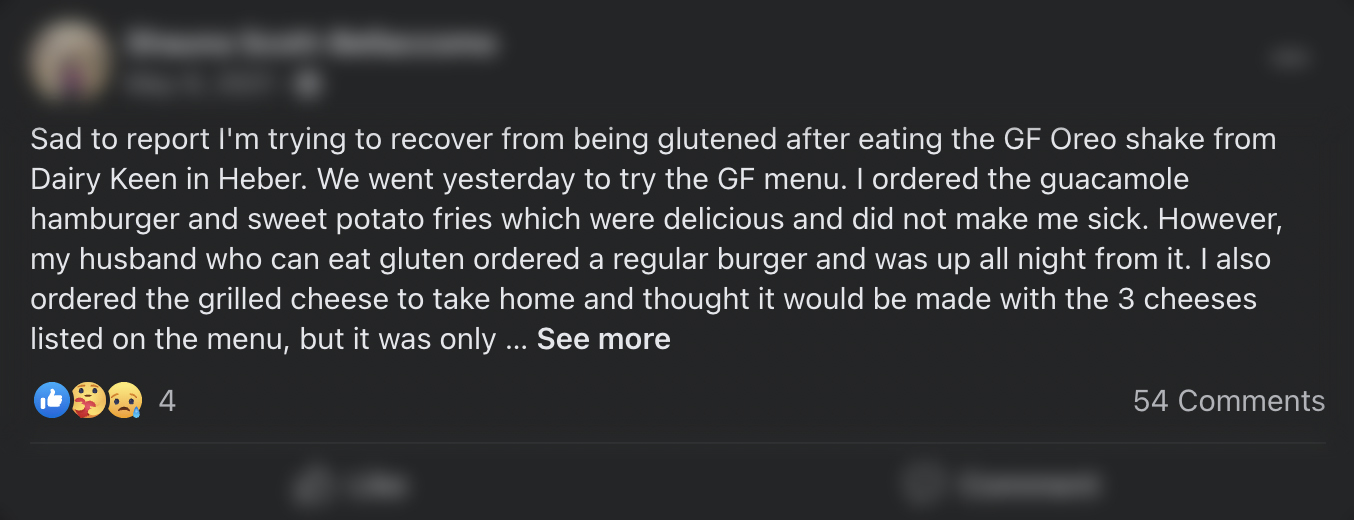
After looking through the evidence, I discovered a spectrum of emotions:
Apprehensive
Timid and nervous.
Gluten is used in a lot of products.
Gluten has many names and could be hidden behind generalized terms.
helpless
Powerless and out of control.
Nobody chooses to have Celiac Disease.
Living a strictly gluten-free live is the only way to keep the damage to a minimum.
Frustrated
Annoyed and infuriated.
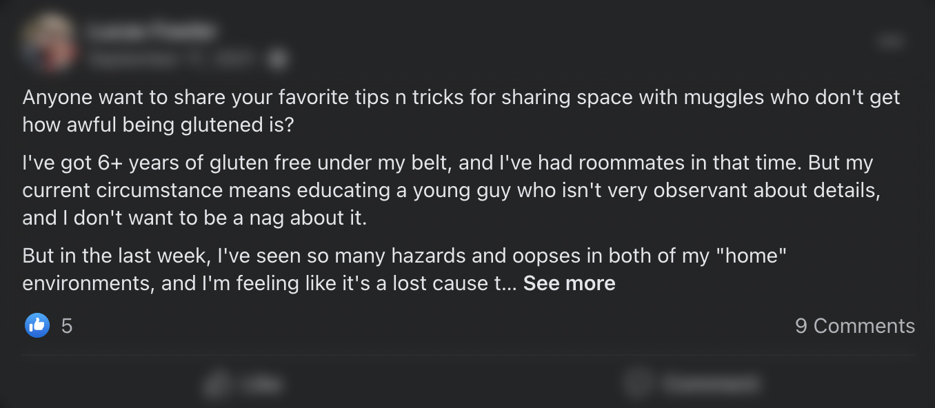
Not a lot of non-Celiac people understand the restrictions.
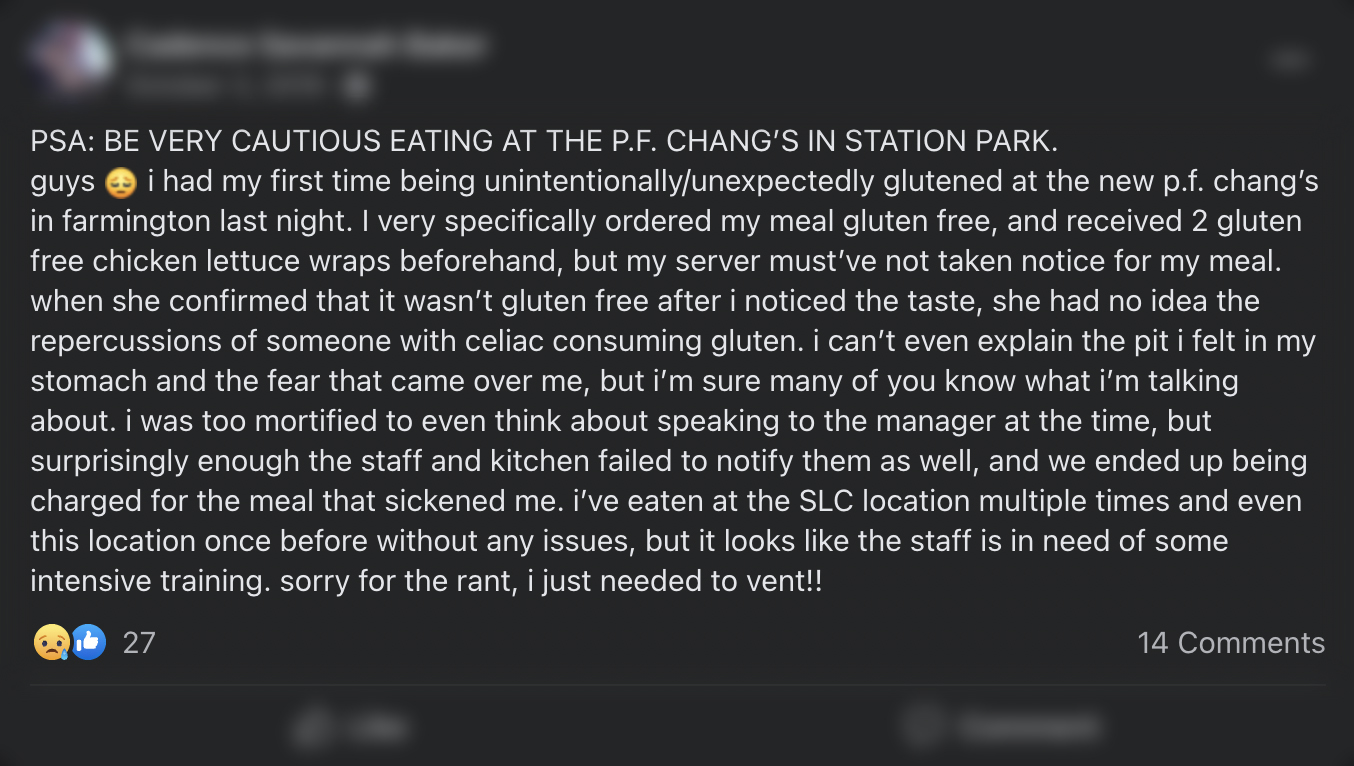
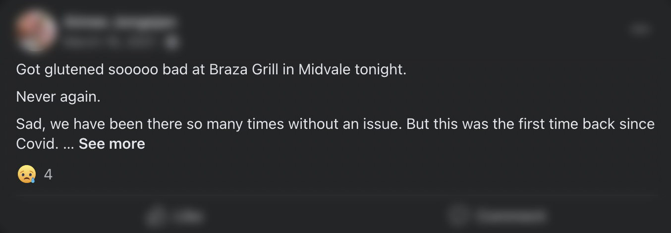
People can mean well, but then accidentally cross-contaminate food.
fragile
Vulnerable and exposed.
Finding food that’s safe to eat can be disheartening.
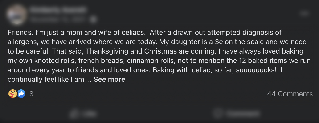
Social gatherings can quickly turn into being singled out for bringing your own food.
A: 9-question Online Survey | typeform
Quantitative Research
responses
READ THE FULL REPORT >
(you won’t believe how many people track their 💩 !)
B: Observations | real social situations
Qualitative Research
years
occasions
C: Remote video interviews | Zoom
Qualitative Research
people with celiac disease
THE TWO PERSONAS >
that materialized after the research
How might we
How might we design a tool for a user that is intuitive and easy to use, reduce the cognitive and emotional load and help people find safe-to-eat food with Celiac Disease?
Livey’s character
Livey is an app for people who desire to feel connected with others. Their goal is to belong and fit in, despite an alienating diagnosis like Celiac Disease.
The app empowers this group of people through a sense of realism and empathy, by providing tools and features that help make informed decisions.
Aiming to be accessible (read: usable and useful) to a diverse group of people, Livey fosters equity, democracy, and group identity.
voice
Livey is the empathetic but realistic connection between people, data and information that helps build knowledge.
Tone
The tone can be friendly, happy, informative, or deeply compassionate, comforting.
Style
Conversational, expository
Persona
Neha the CD Newbie – Persona #1

Neha has a busy schedule. She’s juggling her 3/yo twin girls, her work, and her passion—cooking healthy food for her family daily.
Neha gets most of their groceries delivered weekly in order to save time, but she goes to the store every now and then to find new, gluten free treats.
She also has Dyslexia, which is a brain-based condition that makes reading and spelling difficult.
Neha's Goals and Needs
- Neha loves to cook for her family; She needs Celiac-safe ingredients that are tasty enough so her kids and partner will continue to eat the food she prepares.
- She wants to remain a valuable part of her friend circle and go to social get-togethers like she used to before the diagnosis.
- Neha needs a companion by her side to help her get through the steep learning curve of having to live a gluten-free life.
Neha's Frustrations
- When Neha goes to the store, she gets discouraged trying to read the ingredient labels.
- She’s still in the initial learning phase and keeps getting glutened, because there’s a lot of different words for gluten-containing ingredients, on top of a lack of reliable and detailed, easily accessible information.
- Her friends and family don’t understand her new dietary needs and keep her at risk in social gatherings.
Neha's Motivation
- Neha’s main motivation is that she knows she can be pain-free and have more energy when she stays gluten-free.
- Neha wants be able to cook delicious and safe food for her family so they can continue to eat together.
- She is scared of the long-term dangers of Celiacs (cancers, organ damage, depression, the negative consequences of nutrient malabsorption) and wants to avoid that.
Neha's Quotes
“I just want to be able to make an informed decision about the things I put in my body.”
“I don’t want to be fussed about. I just wanna do my own thing. If I have to explain myself every single time I reach for something, I’d rather just stay home.”
“It feels like all of the sudden I’m an outsider in my own life. I just wanna belong again.”
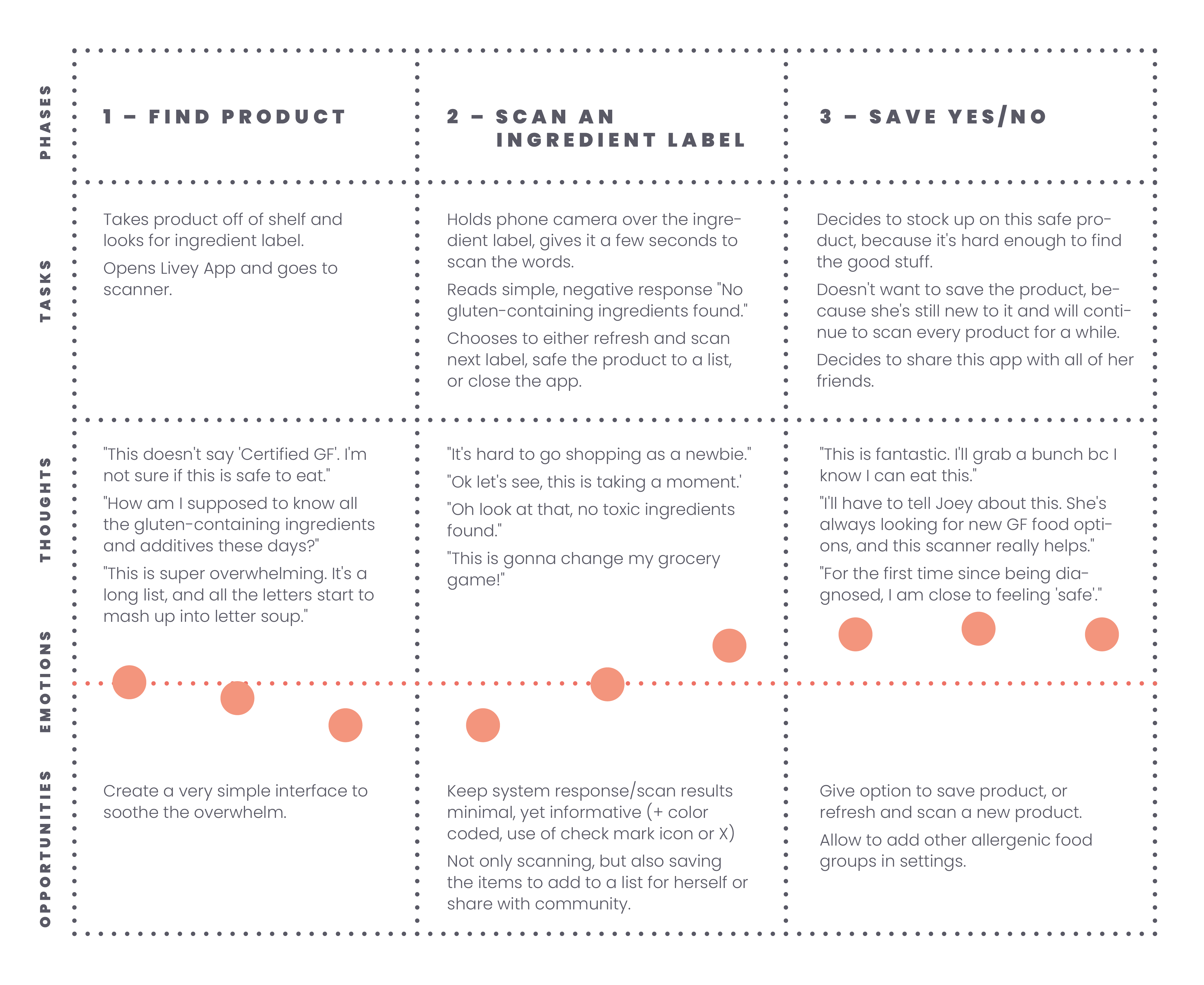
Neha’s User Journey – shopping in-store
Neha was diagnosed with Celiac Disease a few weeks ago, but didn’t get any practical information on what this means for her future besides “stay away from gluten”.
She just downloaded the Livey app.
In this scenario, her goal is to figure out if a food product contains gluten.
–––
By mapping out her emotional journey, I was able to see her frustrations, but also some opportunities for the app to help and make her life easier.
“…82.8% of patients reported ‘always’ or ‘often’
adhering to a [gluten free diet]…”
Source: Celiac.org
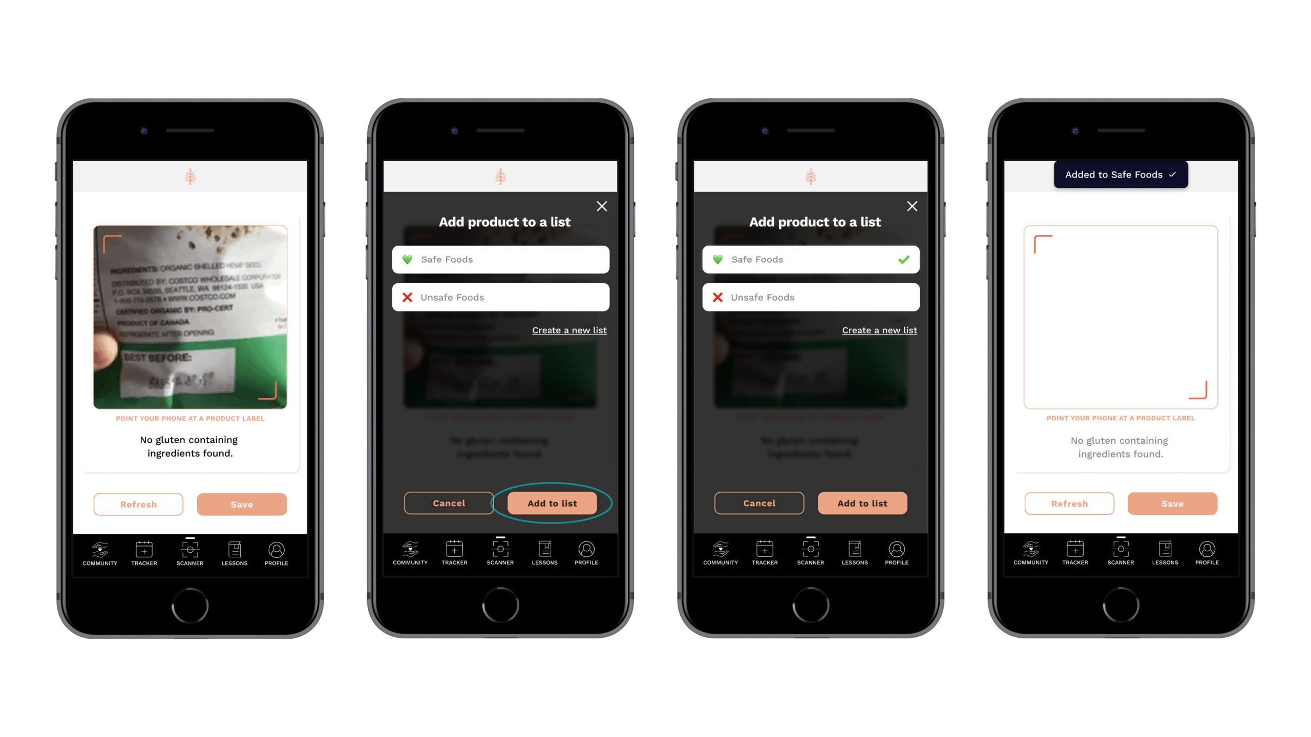
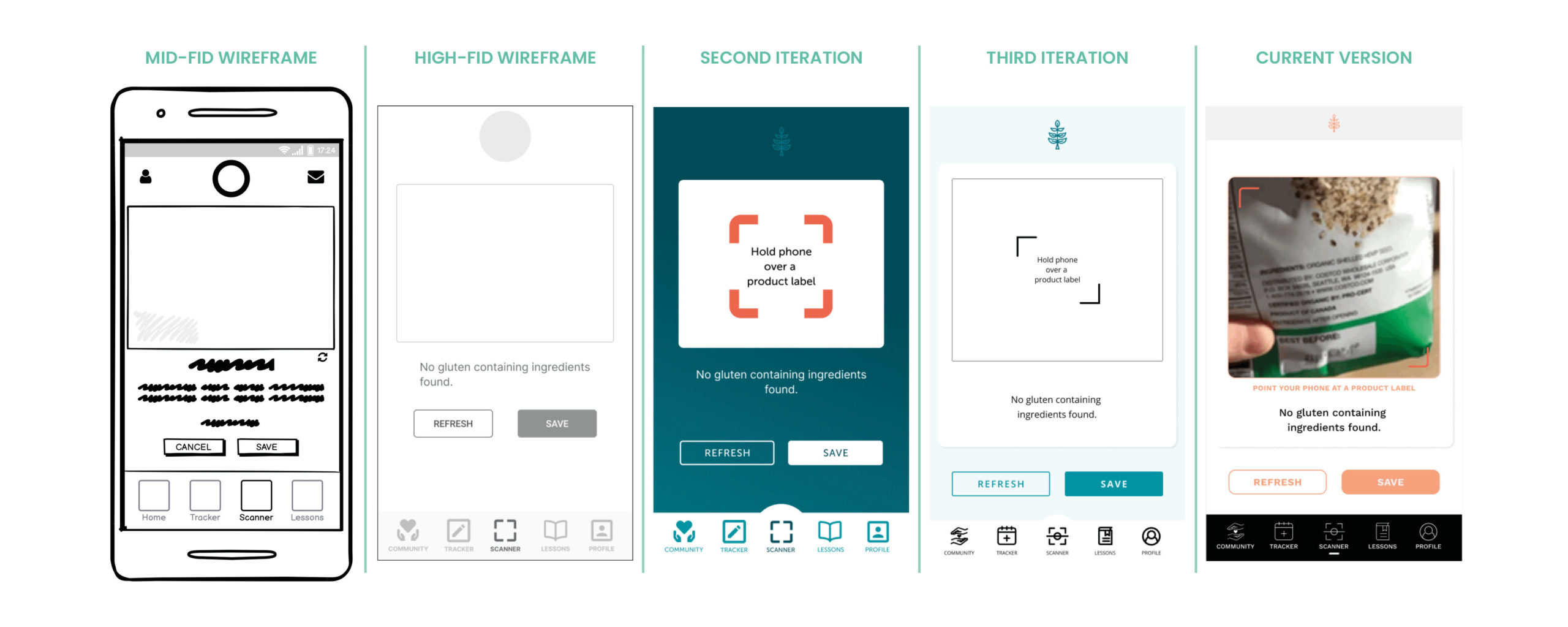
Scanner wireframes
Newly diagnosed people, people who have Dyslexia, or people who want to explore new products and don’t know what to look for on ingredient labels, were big proponents from the first time I brought up a potential Scanner feature.
Based on the positive feedback, this was a fairly quick rough draft.
After going through a few iterations in the early phases of the Scanner, I saw that the “Cancel” button didn’t have a real purpose. So I got rid of the small refresh icon underneath the Scanner window and added a “Refresh” button instead.
Content iteration #1 – tone
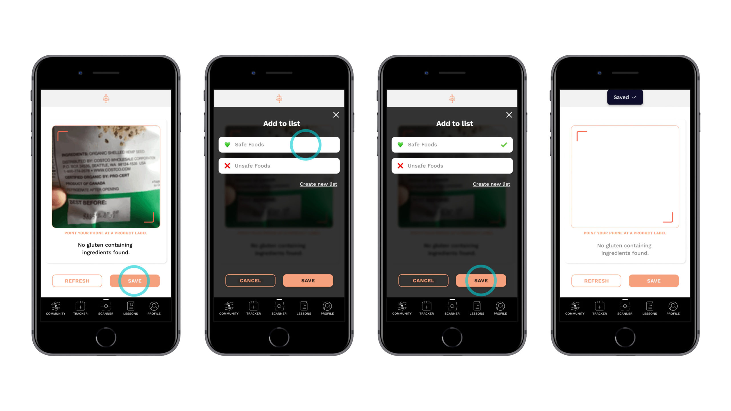
I went back to the whiteboard and rewrote the content. The tone is supposed to be encouraging and reassuring.
While this might be a stretch for the Scanner app, I didn’t want it to sound too cutesy, because if someone uses the Scanner on a regular basis, these bits of copy get old really quickly.
Now every screen can be standalone and the user knows what they’re doing and where they are at any step of the interaction.
While it was cool and informative at first, the tone now is much friendlier, and it is clearer what’s happening at any point.
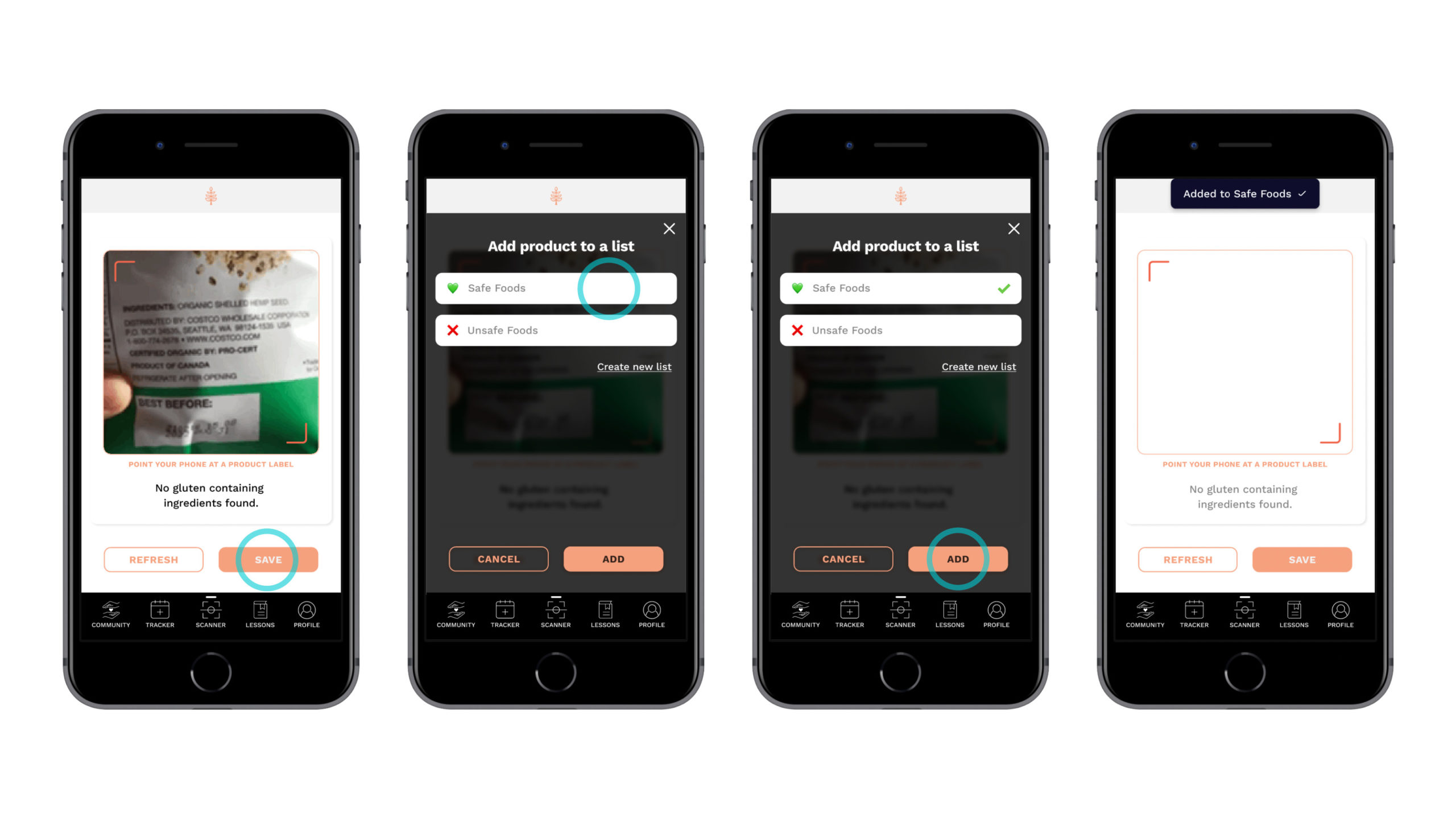
Content iteration #2 – Style
I ran my prototype by a veteran content designer, and she asked me whether the all caps button copy was intentional.
When I worked on the wireframes, all words were capitalized for legibility.
Based on those wireframes, I created the mid– and high–fidelity wireframes and the clickable prototype, without correcting the original style.
Given the caring and empathetic personality of the app, of course I needed to change that throughout all screens.
Nobody wants the subtle feeling that the buttons are yelling at you to REFRESH, or SAVE. Especially when you’re already in a vulnerable state of mind.
I took the opportunity to work some more on clarity for the button.
